How to Make Your Content More Readable

Notice anything different?
A quick story to help you solve the riddle…
Last night, I was going through my inbox when I came across an email from a talented coach named Kim.
I wanted to read Kim’s email but I didn’t…
…because the font was too small.
My aging eyes struggled to read it — even with help from glasses.
When I bumped up my browser zoom, Kim’s message extended beyond the margins.
Not readable.
Kim subscribes to my list, and she’s told me she values my insights. So I replied to her email with some unsolicited advice…
Quick tip:
Bump up the font size.
It will be more readable = More people will read it.
Readability matters.
You can write the most captivating, info-taining content on earth.
But earthlings are a lazy, impatient bunch.
If you make them work too hard to read your content, they’ll tune out and move on.
(That’s one of the reasons my emails have VERY SHORT paragraphs. More readable.)
So readability was still on my mind this morning when I opened an email from the great copywriter Drayton Bird.
And (go figure!) it was all about readability.
A crazy coincidence? Or were the readability gods sending me a message?
In his email, Bird told a sad tale about receiving two magazines in the mail.
They were “beautifully produced.” But they were “very hard” to read.
“That’s because they were printed entirely in san-serif type, upper and lower case, and the captions to the pictures are all uppercase,” Bird wrote.
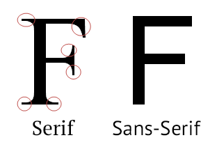
Serif or Sans-Serif
Which is better?
Serif fonts have decorative strokes — small feet, caps, etc.
Sans-serif fonts (“sans” means “without” in French) don’t have the decorative strokes.
Bird cut his chops in pre-historic internet times…
…when print was king and email wasn’t a thing.
Back in those days, David Ogilvy was advertising’s top-dog.
One day, Ogilvy stopped by Bird’s desk and handed him a book about fonts.
“For the first time ever someone had actually taken he trouble to find out what people find easy to read and what they find difficult,” Bird said.
Bird’s big takeaway from the book: “Serif faces help you to read more easily because they keep your eyes on the line and give the letters a clearer shape.”
And he reinforced the point by quoting from the top-dog’s book Ogilvy on Advertising…
Which typefaces are easiest to read? Those which people are accustomed to reading, like the (serif fonts) Century family, Caslon, Baskerville and Jenson. The more outlandish the typeface, the harder it is to read. The drama belongs in what you say, not in the typeface.
Sanserif faces are particularly difficult to read. Says John Updike, ‘Serifs exist for a purpose. They help the eye pick up the shape of the letter. Piquant in little amounts, sanserif in page-size sheets repels readership as wax paper repels water; it has a sleazy, cloudy look.’
Bird added: “You will not find a decent newspaper in the world (printed with the English alphabet) in a sans-serif type – because they know better.that every newspaper on earth uses serif fonts.”
I finished reading Bird’s email. And panic set in.
Oh no! Have I been using the wrong font face for years!!!
I vowed to write today’s email with serif Times New Roman, not my go-to sans-serif Arial.
(Riddle solved. Had you already noticed?)
But then I dug deeper.
Why do most of the top marketers deliver emails with sans-serif fonts?
Group-think ignorance? Or do they know something I don’t?
So I googled “font-readability research…”
…and learned…
Font-readability research is deathly boring!!!!
Don’t do as I did…
…unless you seek a cure for insomnia.
But I soldiered on for an hour and reviewed the research.
(Such are the sacrifices I make for you so your content is readable.)
And here’s what I dug up:
- Some people are VERY PASSIONATE about this. Beatles or Stones? Yankees or Red Sox? Biden or Trump? Those debates are child’s play compared to “Serif or Sans-Serif?”
- The research is contradictory and, for our purposes, inconclusive. Some researchers are on Team Serif. Others on Team Sans-Serif. I’m can’t sort this out.
- Different fonts for different purposes. Print is different than digital. Headlines are different than body copy. What works best for one, may not work as well for another. Just because most newspapers use Serif doesn’t mean your emails should.
And the big takeaway:
Paragraph length matters more than font face.
Many of the studies I reviewed — including one Bird cited — examine the readability of long chunks of text. Serif fans claim those little feet and caps keep readers’ eyes in line and make long paragraphs more readable. I usually don’t do long paragraphs. (In fact, this may be the longest paragraph I’ve written since my college thesis.) So I don’t worry about readers losing their place, which means…
I shouldn’t worry about font face.
(Hooray! Panic attack over!!!)
Many font-o-philes suggest sans-serif fonts are more modern than serif.
We associate serif fonts with newspapers and other print publications (right, Drayton Bird?). And we’re used to sans-serif fonts on our modern computer screens.
But does that really matter? Do readers really think (consciously or otherwise), “This copy is out-of-date and obsolete” when they read serif content?
I’m skeptical. And the studies proved nothing.
In the end…
It’s a matter of taste.
If you like serif, use that for your emails. If you like sans-serif, use that.
I can’t explain why. But I like sans-serif. So, after sending this panic-induced Times New Roman email today, I’ll return to good ol’ Arial tomorrow.
Whichever font face you choose…
…keep the paragraphs short…
…and make the font size large enough.
It will be more readable = More people will read it.
Don't go away yet..
p.s. Coaches, authors, and consultants hire me to power-up their creative content and storytelling to captivate prospects, stand-out and book more business.
Whenever you're ready, here are several ways I can help you become a storytelling stand-out so you'll land more clients without pitching and prodding:
1) Get the Story Power Profit Pack -- 52 Strategies, Tips, and Tactics to Transform Your Content from Ignored to Adored.
2) Watch the free, 7-minute Micro-Training: “The 3 Most Important Storytelling Keys to Captivate Prospects and Inspire Them to Act -- Without Pitching and Prodding.”
3) Become a Story Power VIP: Master how to discover, assemble, and deliver business-building stories. Twice-monthly live masterclasses. Members-only content. One-on-one feedback and consulting sessions. And more… If you'd like to learn more about our VIP program, just reply to this email and put "Story Power VIP" in the subject line. I’ll contact you with more details.
4) Work with me one-on-one: If you’re interested in working directly with me -- to discover, assemble, and deliver powerful, business-building stories -- simply reply to this email and change the subject line to "Private Client." Tell me a little about yourself, your business, and what you'd like to accomplish, and I'll reply to discuss options.
5) Invite me to speak at an event: I can tailor a presentation that meets the specific needs of your organization. Informative. Entertaining. Virtual or live. Potential for continuing education credits when applicable for your group. If interested, reply to this email and change the subject line to “Speaking Engagement.” I’ll circle back to discuss the possibilities.
Want to get great content like this...
...delivered straight to your inbox?
Join our email list...
Post Categories
Previous Post
Next Post